Outcomes at a glance
1.6M
Annualized contacts eliminated post-launch
TCF neutral
TCF (total contact friction) held neutral — self-service volume rose, escalation rates did not
3 → 1
Three fragmented contact systems unified under one model
Live ↗
Shipped Nov 2020 · Established design foundation and 3-year roadmap
Problem
Amazon’s help system was built to send people somewhere else, not solve their problem.
Problem 1
Customers kept landing on pages they’d already visited. CS sent them in circles with no way out.
Problem 2
When self-service failed and a customer reached an agent, they had to explain everything from scratch. The system remembered nothing.
Problem 3
Actions like returns and refunds lived on product pages, not in help. Customers who needed more support had nowhere to turn from there.
Research
Diagnosing existing help channels
before designing one
The assumption going in was that chat was underperforming because of execution issues — bad copy, slow bots, poor routing. The research told a different story. In Fall 2019 we ran a baseline study measuring how customers rated each channel on effort and confidence. Self-service ranked low effort, high confidence. Message Us and AVA landed in the opposite corner — not because the interfaces were broken, but because customers came to them already frustrated and with low expectations baked in from other industry products.
Self-service (SS)
Multiple centers of gravity — Help, Your Account, Your Orders, etc.
Message Us (MU)
Chat platform to solve problems with a bot.
AVA
Speaking to a voice-bot to solve issues.
* CSA — Customer Service Agent: the escalation path where a customer connects directly with a human Amazon representative to resolve their issue. Highest confidence in resolution, but the most effort-intensive channel for both customer and business.
A stakeholder session to map what each platform was genuinely good at, and where the real gaps were. No advocating for any one product. Just an honest audit.
Strengths
Weaknesses
Strengths
Weaknesses
Strengths
Weaknesses
Self-service gave customers the most agency, but the actions and solutions lived in chat and voice channels they didn't trust. The opportunity was in combining what each did well, and cutting what slowed them down.
How might we make it effortless for customers to solve their issue by …
- Solving most issues inline without a redirect?
- Gathering customer intent and carrying it forward?
- Allowing those who really need or want human assistance to get it?
Model
Unifying three channels into one
Rather than replacing what existed, I mapped the strengths of each product and found the joints between them. One system. Three distinct jobs.
Initial explorations & user testing
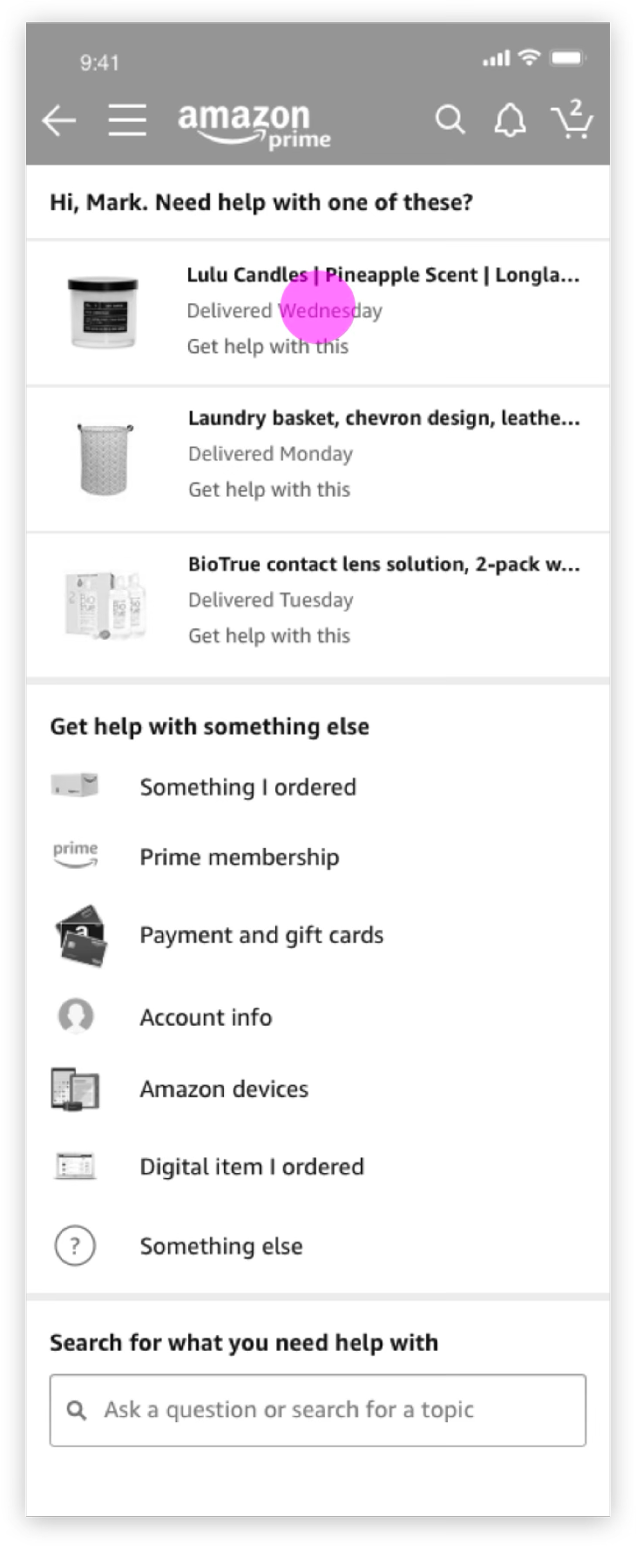
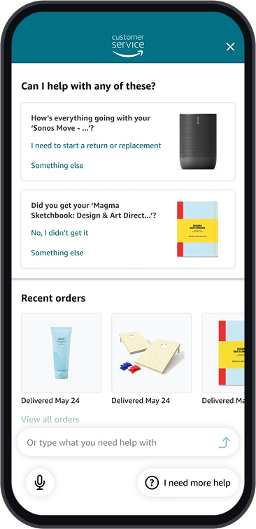
The early explorations put the three-layer model to work: a Hub that predicts, a Funnel that clarifies, a Solve that resolves.
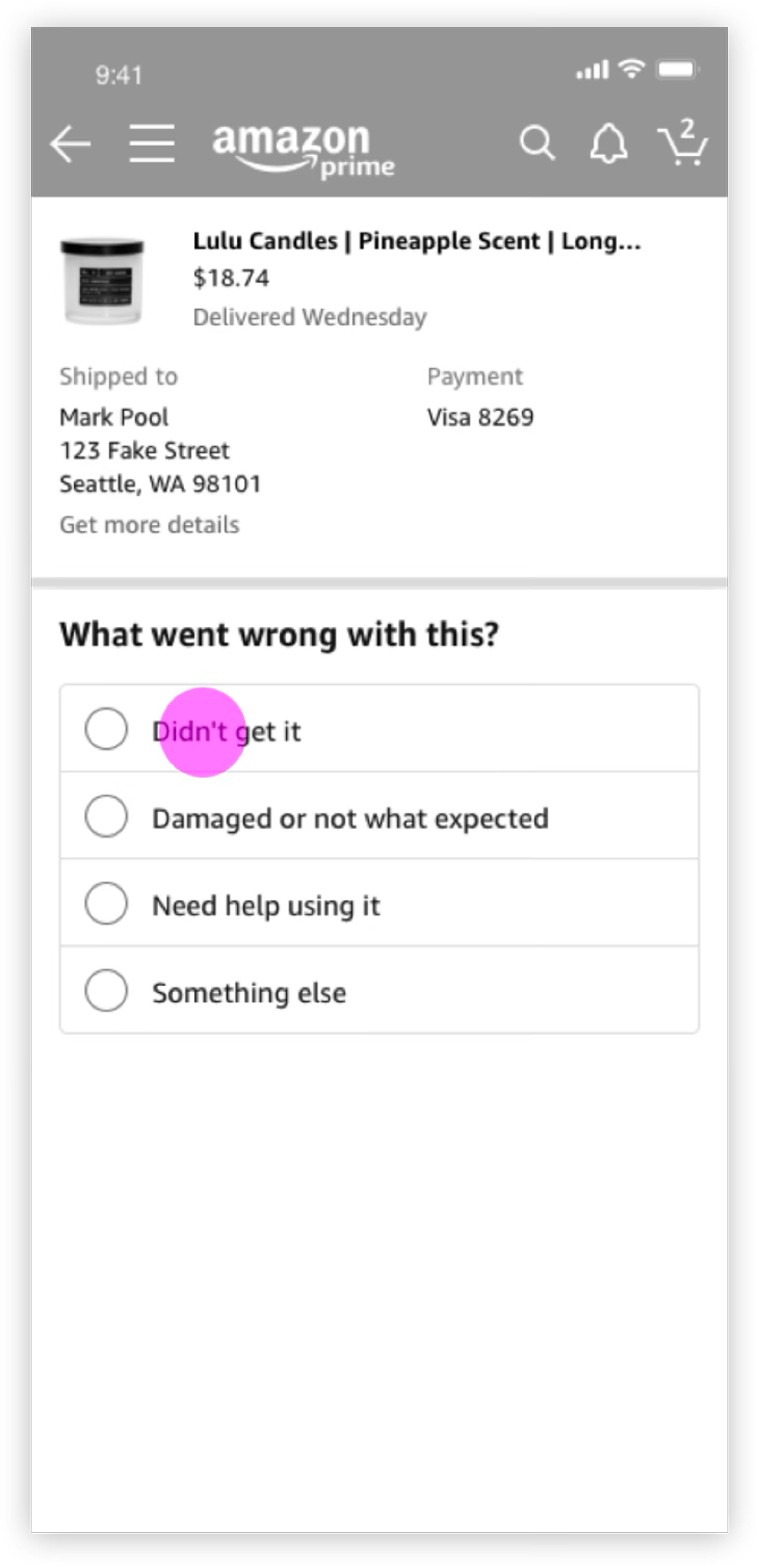
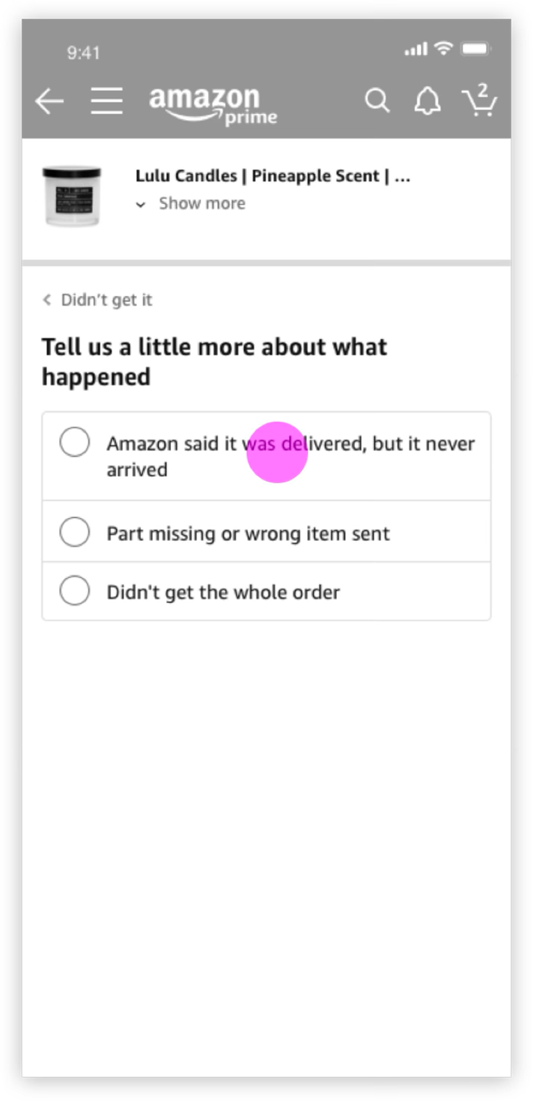
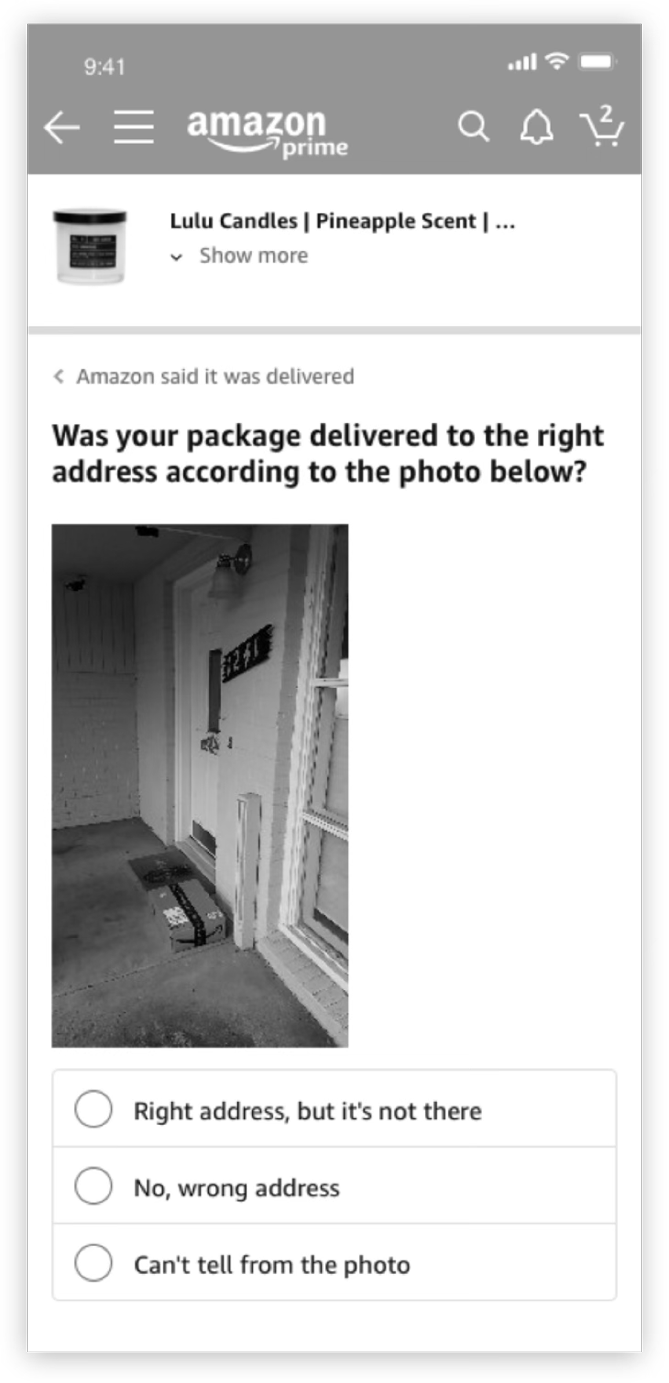
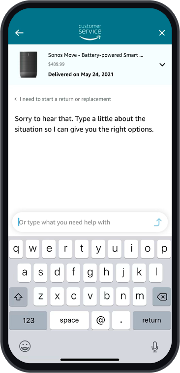
The Hub surfaces predicted issues as cards, so customers start with context already in hand instead of a blank search. Tapping a card enters the Funnel, a short sequence that captures intent precisely enough to route to the right resolution.
Early testing surfaced a gap: customers with messier problems (an unrecognized charge, an order that was only partially wrong) couldn't find themselves in the options we offered. The system was too sure of its own categories.
There was a push internally to add more categories to cover the edge cases. I argued against it. More options would have made the Hub feel like a form to fill out, not a system that understood you. That tension forced a harder question: what if we stopped asking customers to classify their own problem entirely?
That reframe shaped everything that came next.
Next design iteration
The key insight was simple: customers knew exactly what their problem was. They just couldn't find it in a list. The fix was to stop making them choose and let them say it instead.
The iterated concept introduced free-text input at the Hub level. Instead of navigating a taxonomy of issue types, customers type naturally (a charge amount, a product name, a question) and the system surfaces relevant matches in real time.
The scenario is an unknown charge on a credit card statement. The customer types the amount, picks the merchant from suggestions, and reaches a resolution without ever leaving the flow or explaining themselves twice.
Three findings from the study, and what they changed:
- Trust in the tool depended on trust in the policy behind it. When customers didn't believe Amazon would actually refund them, no interface fix was going to move the needle. That finding pushed us to bring policy language directly into the resolution layer rather than leaving it buried in help articles.
- Customers who trusted AI engaged more freely with free text. Those who didn't kept their inputs short and hedged. We used this to calibrate the tone and transparency of the AI disclosure copy — less “assistant,” more plain acknowledgment of how the system works.
- The conversational tone landed well. Customers responded positively to language that didn't sound like a legal disclaimer. That validated doubling down on natural language throughout the Funnel rather than reverting to a more clinical UI pattern the stakeholders had pushed for.
Final design
The system, shipped.
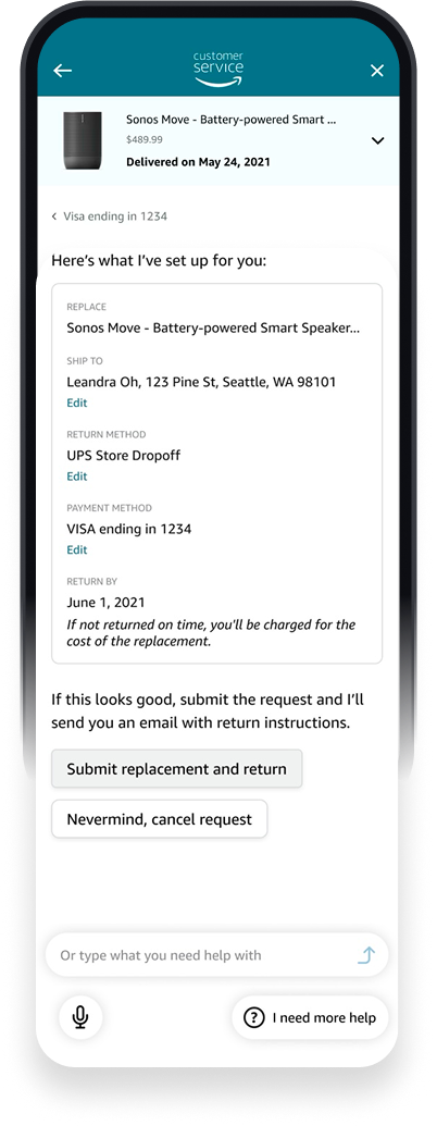
These four screens are one customer journey: a Sonos Move that never arrived. What shifted isn't the screens, it's what the system already knows by the time someone opens help.
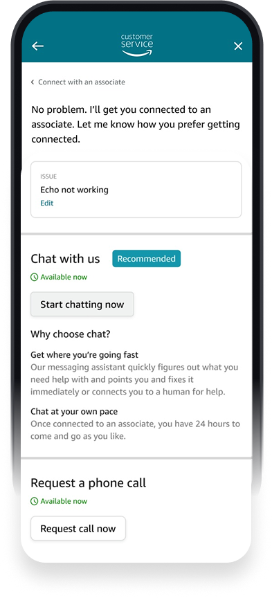
The Hub surfaces the right order before the customer says a word. The Funnel gathers intent through natural language. Solve presents a pre-confirmed resolution (address, return method, payment) ready to submit. If they still need a person, the agent receives full context. The customer never repeats themselves.
Four screens. One decision, played out: meet people in their own language, carry their context, and get out of the way.
Outcomes
1.6M
Annualized contacts eliminated post-launch
TCF neutral
TCF held neutral — more customers resolved issues themselves without making escalation any harder to reach
3 → 1
Three fragmented contact systems unified under one model
Live ↗
Shipped Nov 2020 · Established design foundation and 3-year roadmap
Looking back
What I'd do differently
Move upstream on policy earlier. Customer trust issues weren't UX problems. They were policy legibility problems that sat above everything we built, and we ran into them late.
Partner with data science from the start. The intuitions about where trust was breaking down needed to become measurable signal, not just qualitative observation.
Make CX tradeoffs visible in real time. When constraints are surfaced early, they become deliberate sequenced debt. When they're not, they become quiet inheritance for whoever comes next.
What I learned
Systems design at this scale is mostly about managing where intent gets lost in translation — between customer and interface, between interface and backend, between teams. The hardest design decisions weren't visual. They were about what the system should know, when it should ask, and when it should get out of the way. That framing has shaped how I approach every product problem since.